Initiative status: Shipped to Production.
Request
“The Federal Communications Commission has announced dates by which consumers will see new Broadband Consumer Labels when they shop for services: The majority of providers must display at the point of sale clear, easy-to-understand, and accurate information about the cost and performance of broadband services by April 10, 2024.” Federal Communications Commission (FCC)
Challenge
To determine the best option to display a Broadband consumer label as required per FCC for a large quantity of plans, multiple brands (9) and over 10 different customer-facing channels. Minimize negative impact, if any, on consumer behavior. This was a large initiative across all journeys.
Category: Compliance
Role
Lead and coordinate initial exploration across all impacted brands under the Verizon Consumer Group (Post-paid and Pre-paid). Select and present optimal options and coordinate across all brands. Present options to Executive Leadership, define strategy and lead implementation across all portfolio of TracFone heritage brands (9), which included millions of customers (double digits 😉 ).
Coordination was done across all the following brands: Verizon, Verizon Prepaid, Visible, Total by Verizon, Tracfone, Straight Talk, Simple Mobile, Walmart Family Mobile, SafeLink, Net 10, Go Smart Mobile, Page Plus.
Teams and Stakeholders
There were many teams involved in this initiative in addition to Experience Design, like: Legal, Compliance, Engineering, Experience Management, Marketing, Digital Operations and Metrics, UX Research, Quality Assurance, Content Strategy, Operations and Network, Government Discount Programs, Care, Training and many others.
Process and results
As usual when working with multiple teams under different areas (and brands), all of us had different priorities and requirements. Exploration was a key element to get the momentum needed to achieve a decision.
Key Objectives
1
Present offerings transparently
2
Empower customer choice
3
Avoid friction against customer goal
Methodology: simplify decisions by providing an exhaustive list of options that would be aligned with best customer experience, while also being in compliance with Legal teams.

Exploration: Placement and UI Mechanisms
Location, Location, Location…
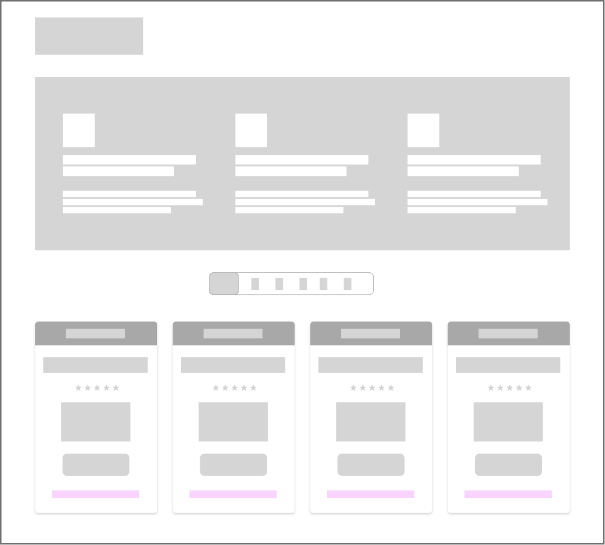
Plan Grid
Includes all plans in one location. This helps evaluate all available plans for a customer.

Plan Detail
Plan page that includes information about a single service plan and all details relevant to that particular plan.
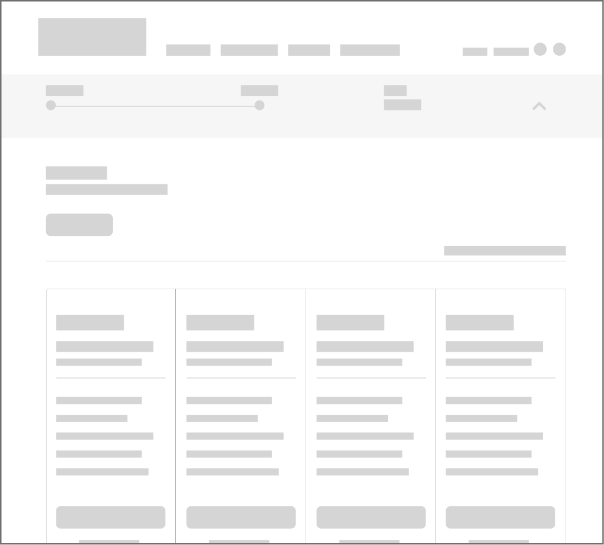
Plan Selection
Plan selection page during the shop device flow. This page is more transactional than marketing-oriented.
Once location was defined and locked, we needed to explore the UI mechanism which would allow us to provide the best customer experience.
UI Mechanisms
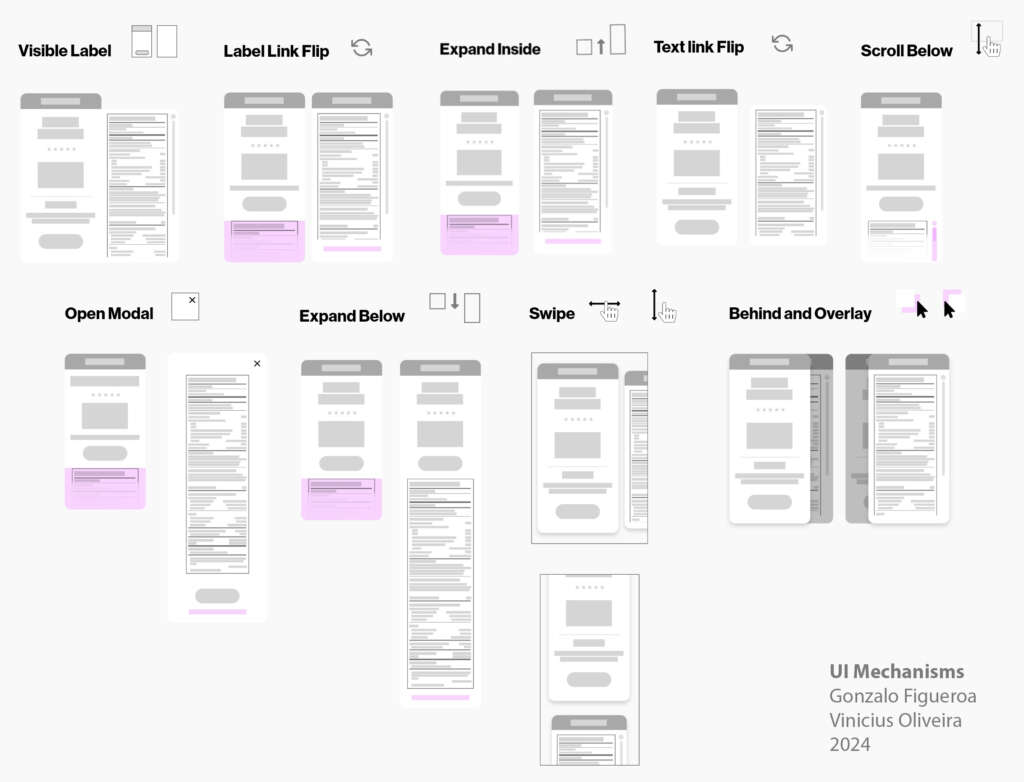
After exploration was completed, many options were available and I socialized this across many areas and levels of the organization. As our journeys and interactions with our customers may be different across brands, I decided to propose three different options that would cover most scenarios. This was evaluated by all other key team leaders on each design area and brands. Once aligned, we showcased this to our head of CX and socialize across all teams and organizations.
We also performed usability sessions, Qual(IDI – Individual In-depth Interviews) and Quan (A/B Testing), to determine expected impact and which one was the initial reaction from our customers.
We finally launched ahead of schedule and we didn’t get any negative impact, being able to be in compliance and support our customers need for moreSample: Straight Talk
In order to provide the best accuracy for your taxes and fees, we asked you for the zip code.

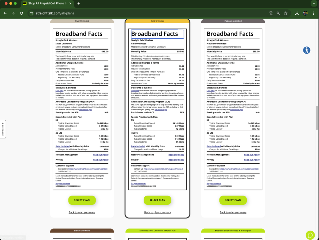
As per FCC mandate, we needed to have the Broadband labels in close proximity to the plans. We decided to improve the access and experience from our customers by adding an anchor link.
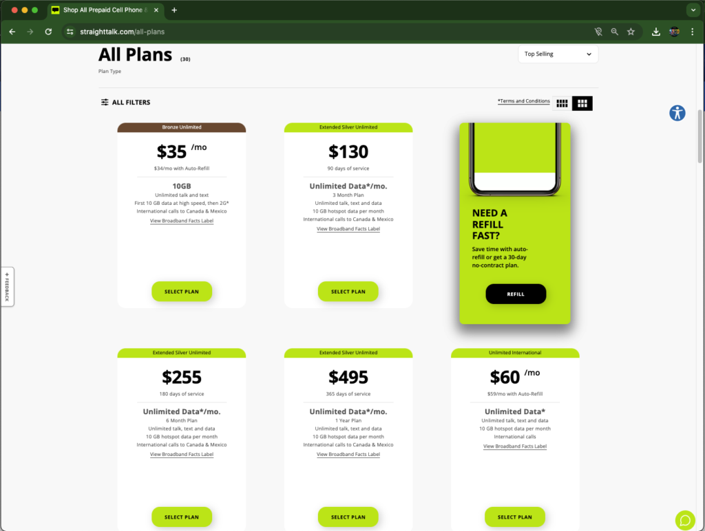
By clicking on the View Broadband Facts Label anchor link, we would redirect you to the label, which we would indicate by an outline, so we can facilitate to our customers which one was the label they were interested into. We also added a CTA (Call to Action) in case the customer wanted to select that plan, avoiding them having to go back to the reduced version of the plan benefits and descriptions.
Learnings and Final thoughts
The initial hypothesis was that we were going to impact the customer negatively. Hypothesis proved to be incorrect and the design decisions made were optimal for all the Trac Brands (9 brands).
Working closely with other design leaders allows you to discover new perspectives and opportunities for growth. I love bringing people together, collaborating, and finding innovative solutions. Facing complex challenges while leading teams is something that motivate me. I genuinely enjoy connecting and simplifying experiences that provide value to the customer and to the company. I thrive in the intersection of those two options, which I believe it should always be a win-win scenario.
Note: Some parts of this study, like all examples and combinations evaluated during exploration, has not been shown due to the sensitivity of the creative process and analysis that was performed.